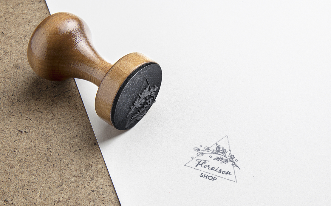
Floraison Shop
Branding & Logo DesignProject Overview
I had the privilege of working on a unique and culturally inspired design project for my friend in Japan who was launching an Instagram store focused on beauty products targeting Brazilians living in Japan. The main objective was to create a logo incorporating floral elements and the functionality of a stamp.
Concept
The concept behind this logo design was to seamlessly blend the beauty of floral lavender or similar with the practicality of a stamp. The design needed to evoke feelings of beauty, tranquillity, and elegance.
Design Elements
Lavender Branch
Lavender is a versatile and popular botanical ingredient that is often associated with beauty and skincare products. In summary, while lavender may not symbolize beauty products in the same way that other flowers like roses symbolize romance or chamomile symbolizes relaxation, it does have a strong association with relaxation, skincare, and overall well-being. Its versatility and potential benefits make it a valuable ingredient and fragrance choice for a wide range of beauty and self-care products.
Stamp Integration
To fulfill the stamp requirement, I designed the logo in a triangle shape with some areas clear to look innovative and creative.
Typography
I used elegant and legible typography to spell out the store’s name. A blend of handwriting and sans-serif font styles was used to reflect the fusion of cultures.
Colour Palette
The colour palette was chosen thoughtfully. Soft shades of purple for the lavender represented beauty and femininity, while a soft green colour for the leaves symbolized growth and vitality.
Outcome
The final design was graceful! Its versatility allowed it to be used effectively across various marketing materials and platforms, making it a valuable asset for the web store’s brand identity.

